Building the WBX Design System
A cohesive customer experience that 3X'd front-end development speed
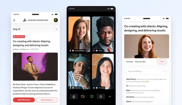
I lead the design team at Webconnex. We make easy-to-use registration and ticketing software for event creators and more. I was the first design hire, so while our software has always been stellar, building out our product’s design style and vision has been a new experience for both myself and the team. When I first arrived, I worked with our product lead and engineering team to design and build out a working style guide. This served us well for a while, but as our team grew, and we extended the style guide further across more and more projects, we noticed a growing list of inconsistencies in our interfaces.
We felt it first with buttons — not with style necessarily, but placement, language and application. We also felt the burn in our content and form layouts, text patterns, and responsive UI. The conversation kept coming up between designers and front-end developers that we were executing newer and newer solutions to similar problems. We needed clear boundaries to work within, but had yet to land on a solution.
Not in Harmony
Design was not in harmony with product and development, and as a result we were keeping both from moving forward. We thought we were following the rules of our style guide, but in fact, we were meeting the needs of each moment as the opportunity presented itself. You need actions in the sidebar? No problem. There’s not a place for those actions in our responsive layouts? Not a problem, we’ll invent new patterns. Over time, we discovered a tension in our user interface between key components like actions, content, layout and more. We delayed timelines, pulled key devs out of other projects, and raised our team’s blood pressure.
Most painful of all, we were setting up our customer’s expectations, and failing to meet them. We were building trust with them to expect certain patterns, but were instead surprising them at ever turn; breaking trust, not building it. We were dropping the ball.
Finding the Edges
The frustration was tangible. I wanted to first get buy-in on the problem; make sure we were all on the same page. I created a simple pitch — shared a few big inconsistencies, presented the problem of missed expectations, showed some small tweaks that could get us on track to creating a better user experience, and if that worked, we’d figure out what to do next. The pitch surprisingly worked, and our team gave me some room to figure this out.
During this time, the rest of the design team pitched me pretty hard on digging into this more. We didn’t need a few changes, we needed a better approach. I was going to be in Sacramento for two days, so our other product designer and our front-end developer, a husband and wife power house, drove down from Redding, CA for us to explore what this could look like.
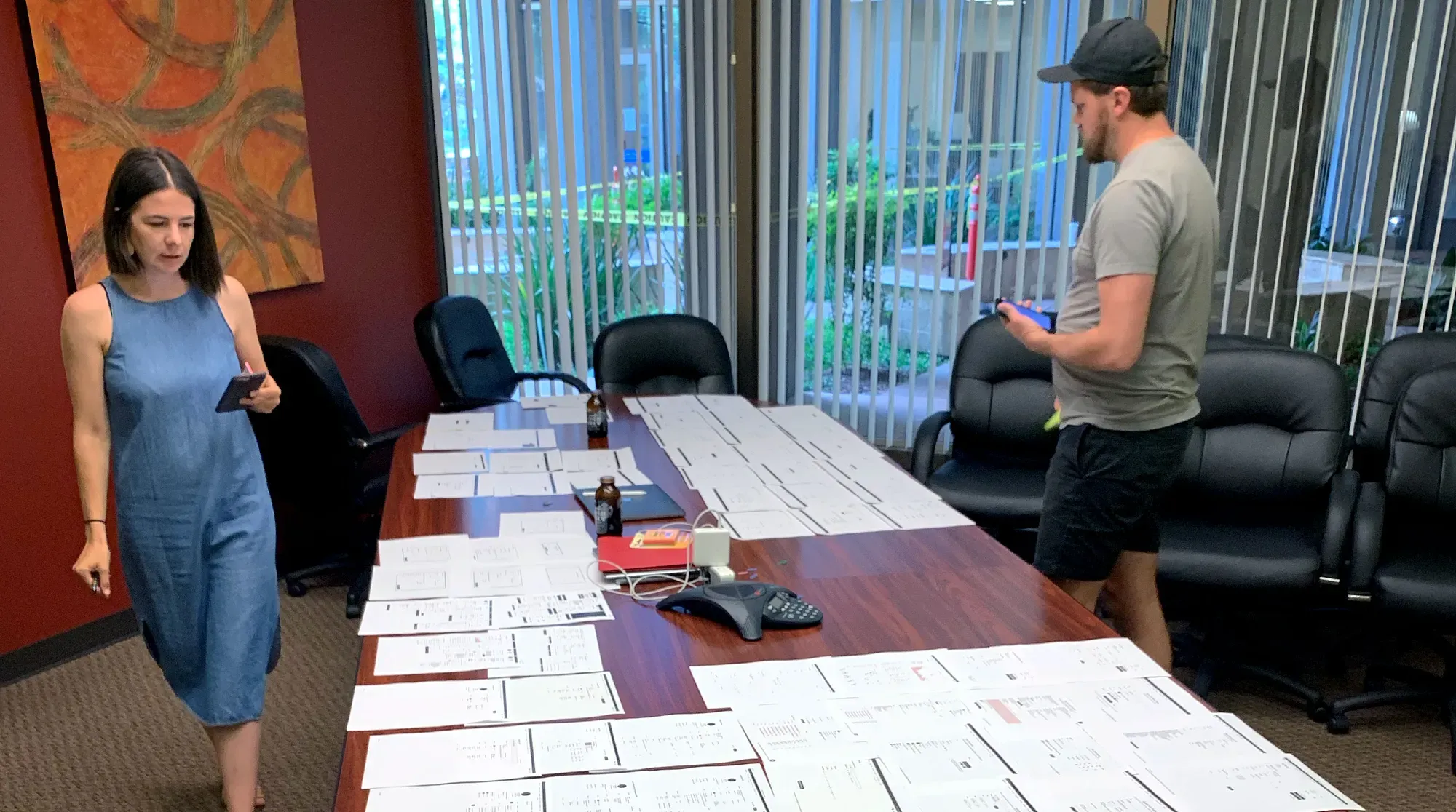
They shared with me Karri Saarinen’s Building a Design Language article. The highlight for us, where we were at in our process, was doing an audit, or a UI inventory. I printed out every screen in our entire product, maybe 200 pieces of paper. This included tables, dialog boxes, dropdowns, expanded sections, and forms, lots and lots of forms. A key pain point for us was not UI elements alone, but in context to the larger story. We needed to see everything and how it was being used. We took over a conference room and laid out every printed interface across a giant table and all over the floor.
We didn’t openly discuss each screen, but instead walked around quietly taking in all the inconsistencies and user interface frustrations (retooling a small cue from Jake Knapp’s book Design Sprint). With sticky notes and pens in hand, the goal was to not overly prescribe solutions, but instead to call out symptoms and where we found them. We each had a different take on the screens. This silent critique became very natural after a while, and the next steps sort of revealed themselves.
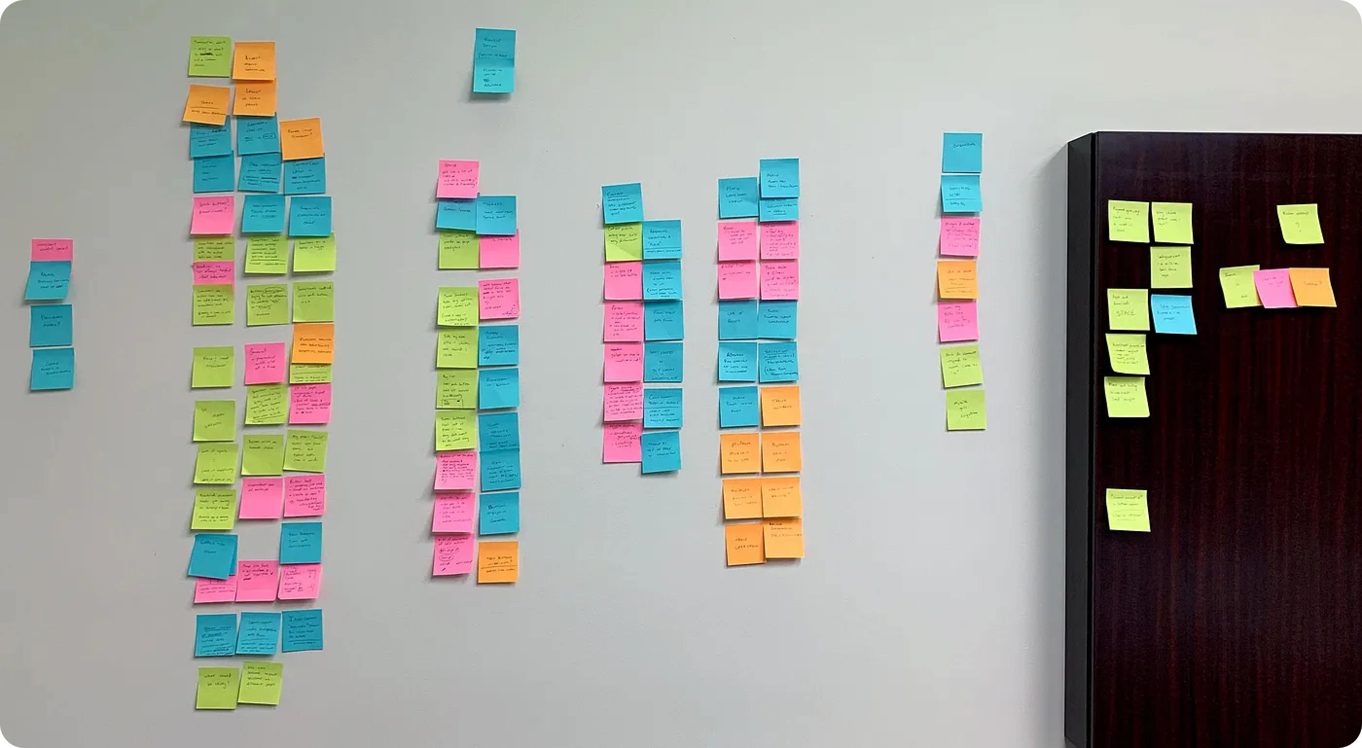
When each of us finished assessing the screens, we placed all our sticky notes across a giant wall. We stepped back and began to group the notes by UI element. Many UI elements were clumsy or frustrating, while others clearly affected a larger portion of our overall product design. Buttons, tables, typography, modals, forms — we had a sense of our biggest pain points. The volume of sticky notes pointed to our inconsistency of style, application and layout. Our problem was not our original style guide, but that we lacked a plan on how to execute it. Our product lacked a shared experience throughout.
Before moving on, I cannot over emphasize how valuable this experience was for our team. We came to a collective epiphany, which deepened our buy-in to both this idea of starting and developing a design system, as well as our connection as a design team.
Floor Plans
With a better understanding of our UI inventory, we moved to mapping out the boundaries of how these components would be used, and began assessing and assigning the goals we wanted to accomplish with our core design components. We created extremely low fidelity wireframes that resembled a home builder floor plan.
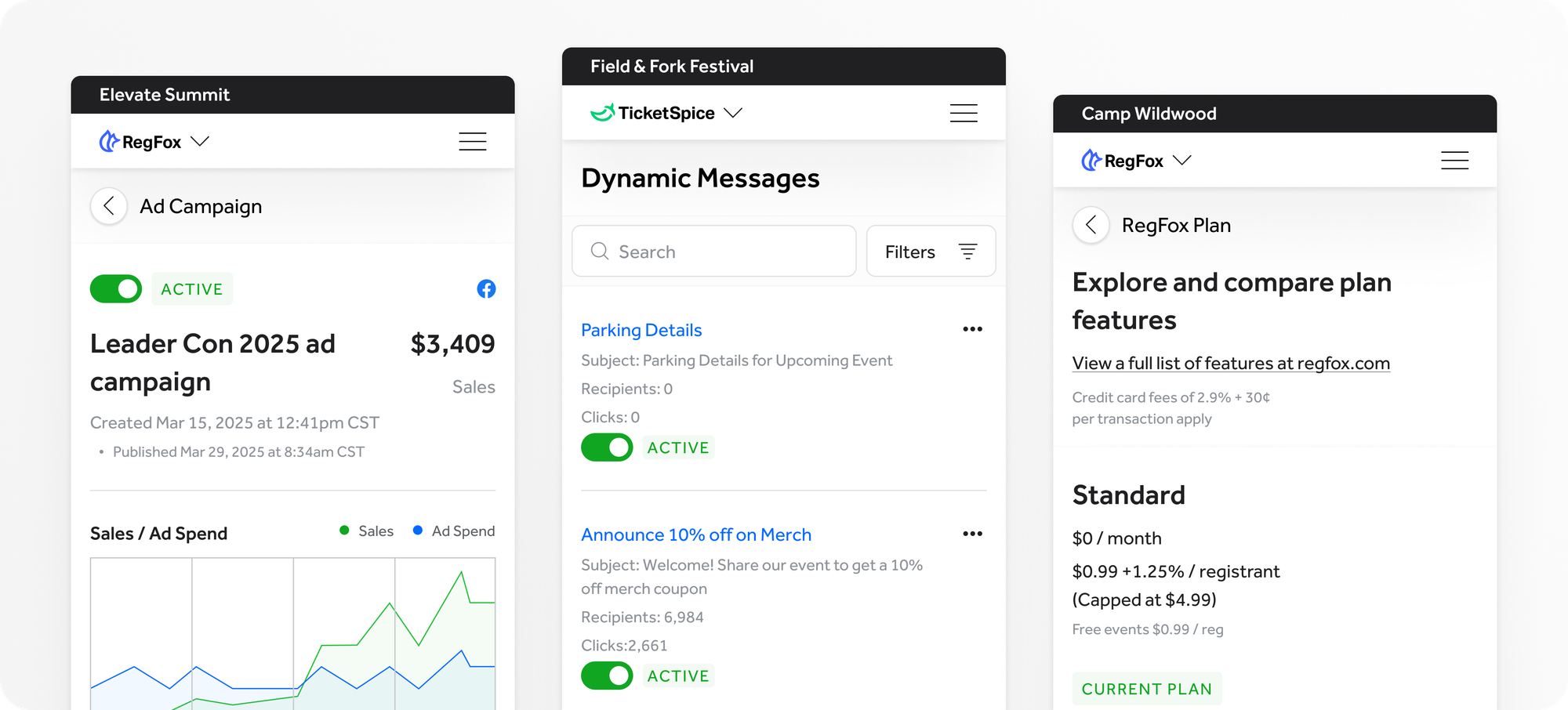
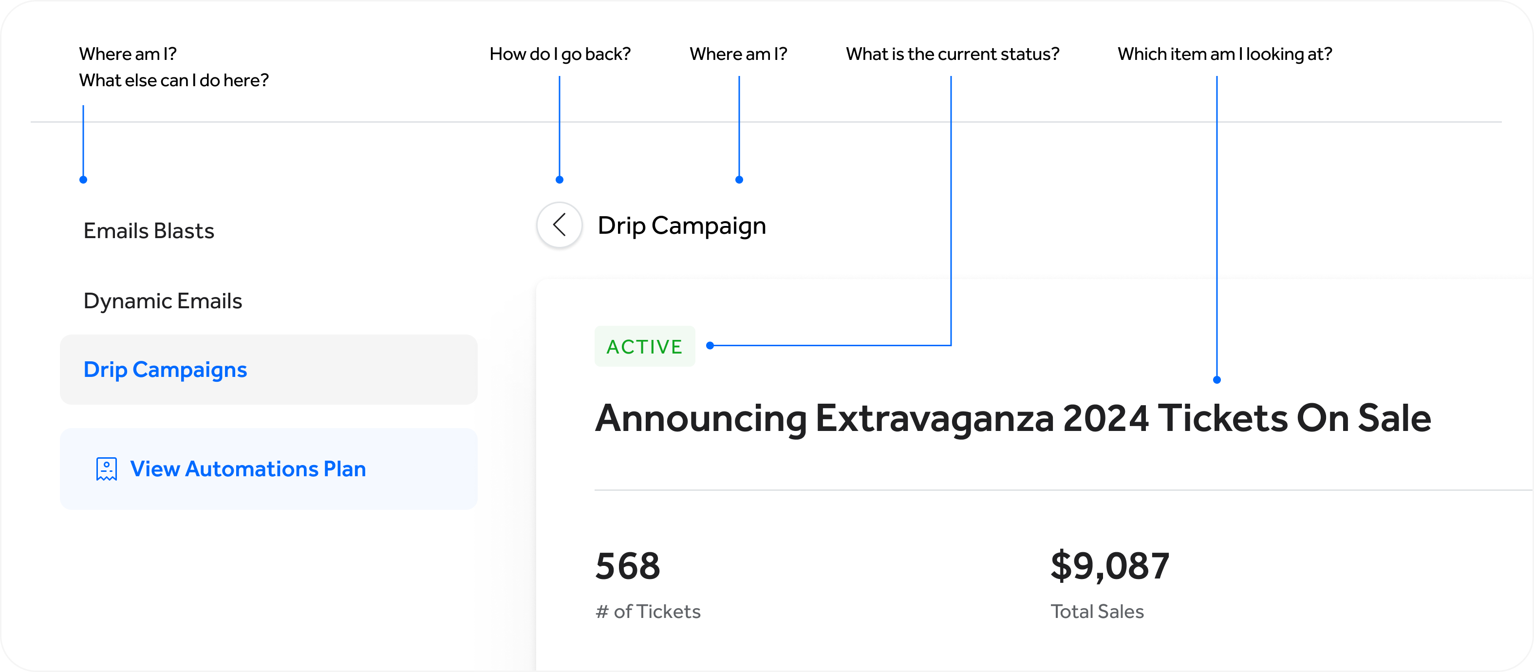
With each screen, each connection between sections of our product, we slowly began to get vision for each component’s place, purpose and limitations. We assigned short names to represent different types of content. These content types were a collection of components. They would help a user answer questions like where am i, what am I looking at, what can I do here, what can I do next?
Too many options to choose from
As you can see, our previous design solutions with these content types were all over the map. We would make the most of the space and cram in buttons, forms, links and more wherever we could fit them. We wanted our product to be mobile-friendly, but this quickly became a nightmare.
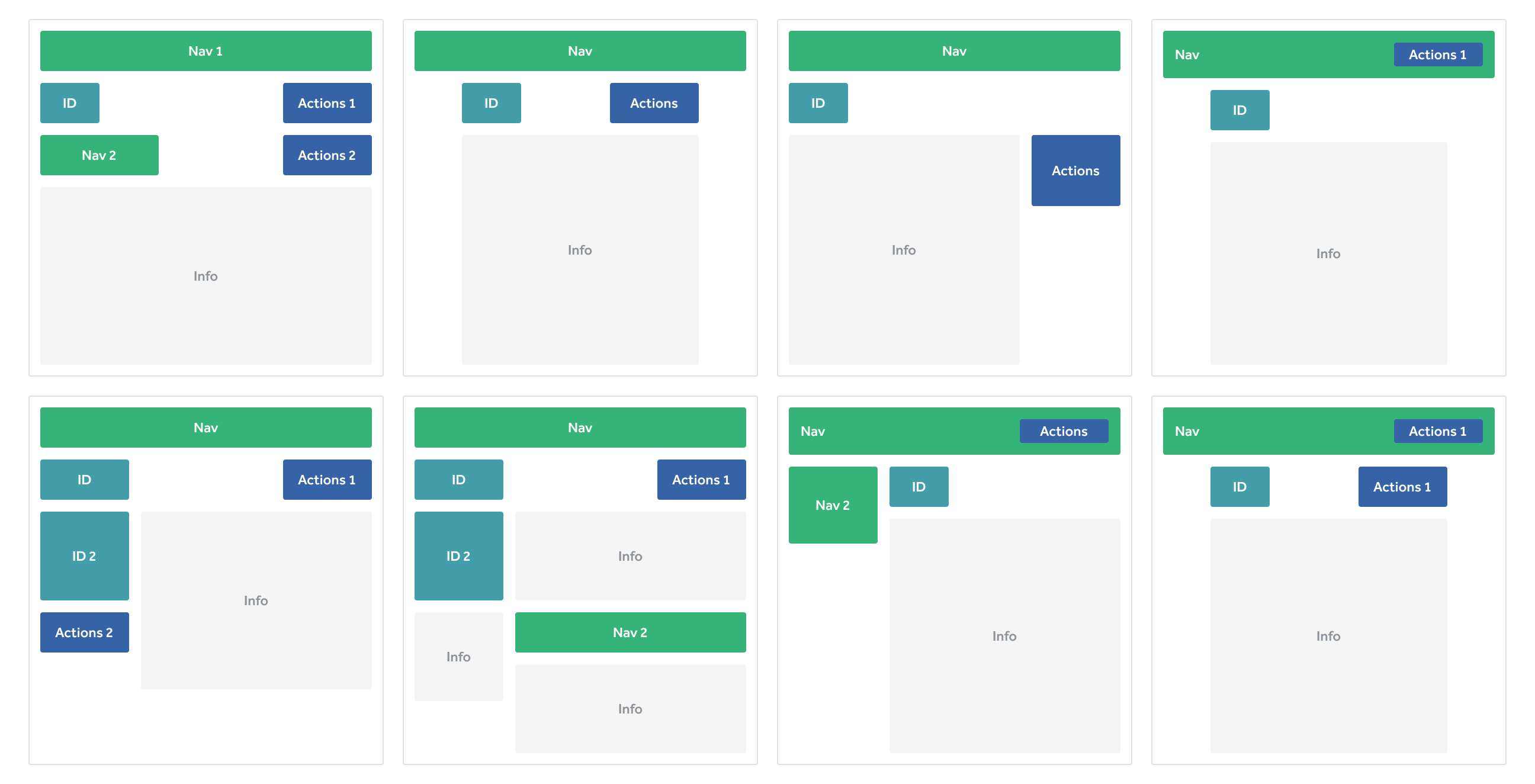
A narrow set of responsive options
We dramatically trimmed down how we presented these content types. We started with the main space limiting it to three page widths. This set us up for a minimal set of options to pick from, but within each there was quite a bit of flexibility. Actions, previously called controls, became a robust component we could expand and collapse for different use cases. And finally, mobile became a priority in our new design system.
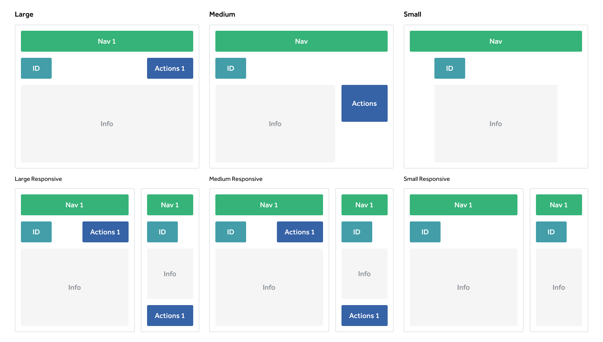
These crude floor plans and content types helped us break apart component from purpose. They allowed us to see our product design from a high level, and see the intention of each feature. We used our floor plans to make sure our customers could accomplish their intended outcome as they move from room to room in the same house.
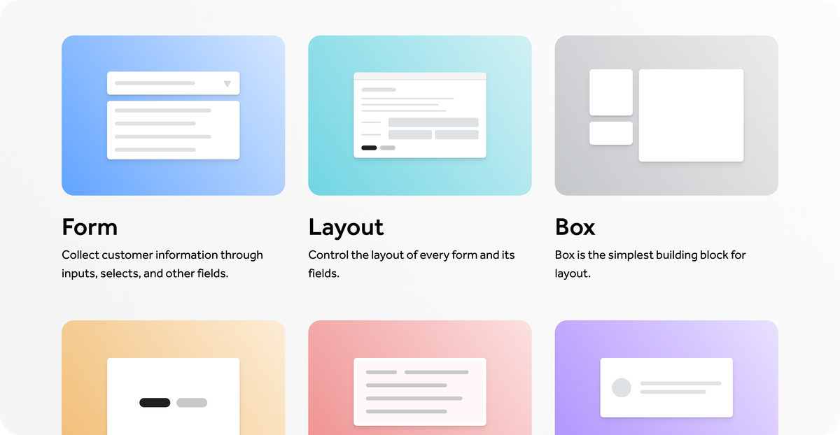
Building Design Patterns
After articulating the problem, creating a map on what needs to be solved and how, we dove head first into the details. Over the next 1 to 2 years we worked with front-end engineers to establish the following tokens, components and standards that became the building blocks of our interfaces.
Scale
Tokenized units grounded our spacing and typography into increments of 4px or 8px creating a concise foundation for padding, margin, font size, and line height.
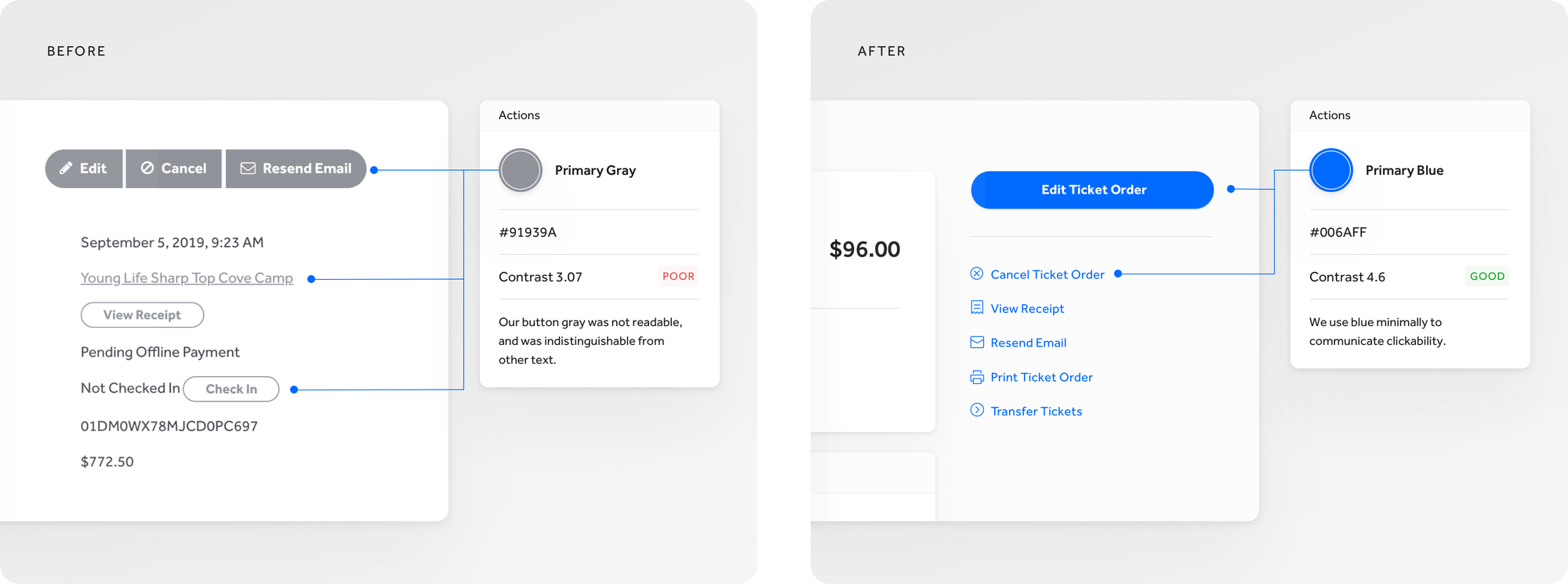
Color
New color rules focused on readability and clickability.
- Readability: We increased the saturation, decreased the brightness, and better aligned the hues on our existing color palette to give the grays more contrast and make the primaries pop.
- Clickability: We no longer allowed color to be flourish or flair, but pure and simple - color communicates clickability.
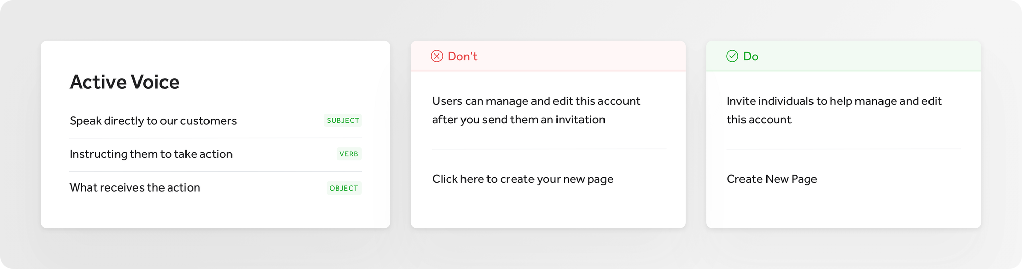
Language
Taking cues from Shopify's Polaris and Flexport's Latitude design systems, I developed a landscape for language including our system grammar, formatting and terminology, and honed in our voice and tone. We know who we are talking to and how we want to talk to them.
Mobile-friendly
We moved our platform from being 10-20% mobile-friendly to 100% mobile-friendly. Every new design pattern and layout needed to be accessible on smaller devices.
Creating focused experiences
We wanted to create consistent expectations for our customers. When they are dropped into a page within our platform they should know where they are, how they got there, and what they can do.
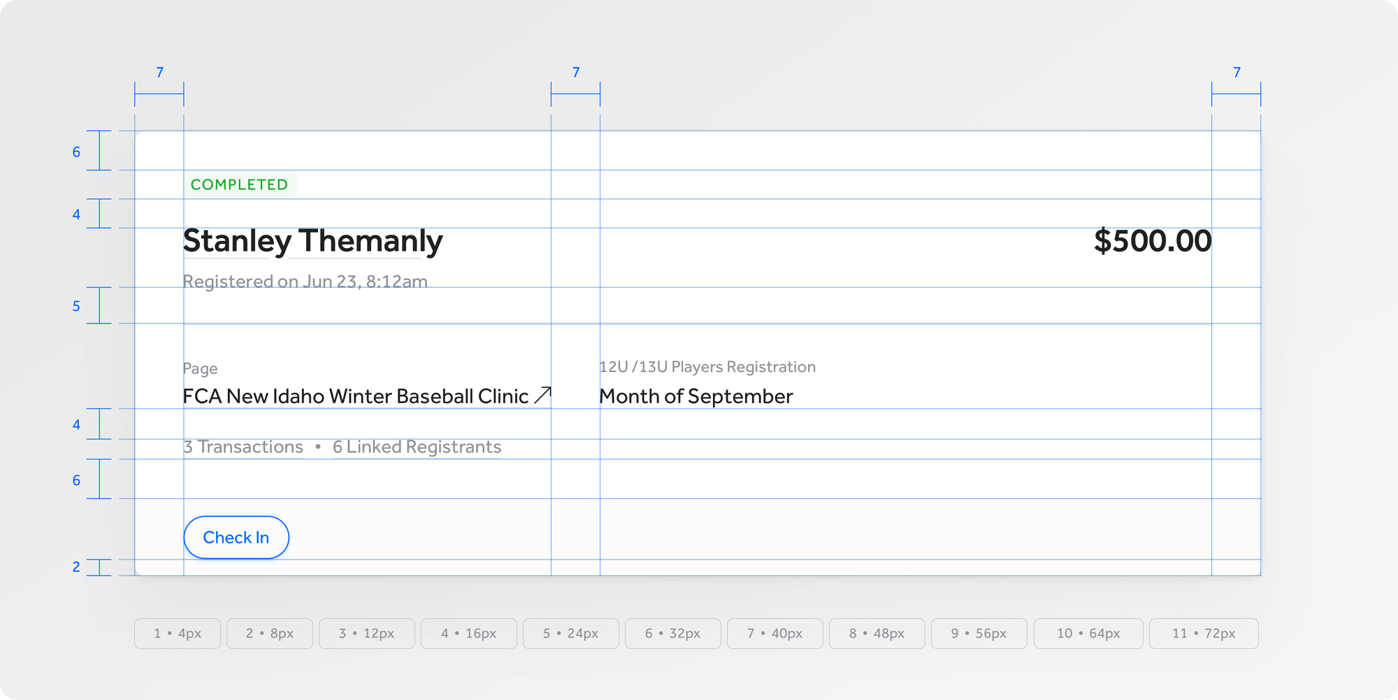
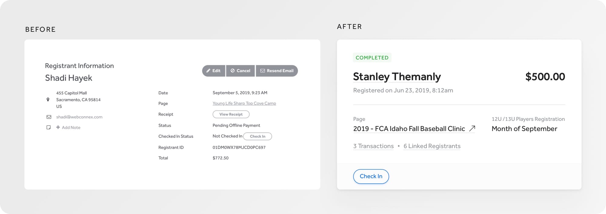
Hierarchy
Previously littered with titles, text and layouts in a variety of sizes, colors and placements, our new hierarchy is founded on page titles that are larger, bolder and with more contrast. We zeroed in on two key types of titles: emphasize where I am in the platform or whose "attendee details" I am viewing. From here, all other text must live in a box container, and hierarchy top down rules apply from an H2 down to labels and help text. This establishes a sort of Russian doll hierarchy.
Actions (or calls-to-action)
Our design system includes more styles to work with like emphasis, size, the option for icon, and a mobile-sized button to make room on smaller screens. We limited placement to top right (to create or initiate), or bottom left (to save or cancel). Other than that, actions can be integrated into our content flow. While this update seems elementary, it provided clear buffers for designers and product managers who kept wanting to fill empty space with actions.
Flow
Our previous grid gave us too many options to mix and match content based on the needs of the moment. We moved to a top, down, left to right content flow. This pushed us to create better content patterns with labeled sections.
Our button placement previously followed a Gutenberg diagram, but I appreciated Artem Syzonenko's thinking on this subject. He posed the idea that actions are presented in a sort of conversational flow, where we are presenting the primary or most obvious options first. We mimicked Syzonenko's flow.
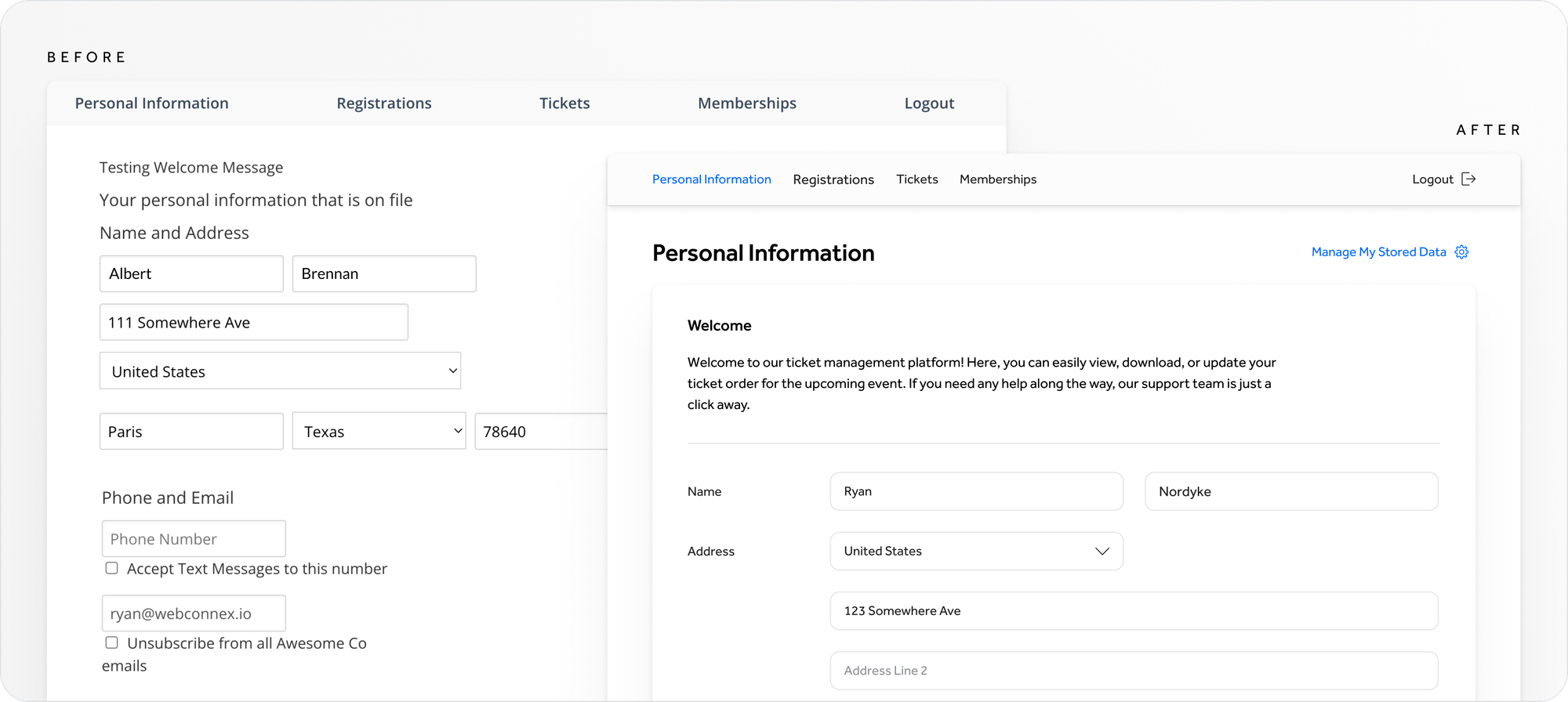
Form Flow
Order, alignment and language were disjointed. We introduced a new legend / field label hierarchy to better organize the many inputs, and we created label language parameters to make forms easier to read and understand.
The Result
Developing our design system has been an ongoing process, but a fruitful one. Before, we approached new projects as individual endeavors. Now, each project builds on one another, and as we develop design patterns or create new ones, we make changes to past designs. We are creating a truly cohesive customer experience and delighting our customers in the process.
(Oh, and we helped our front-end developers build out interfaces at 3x the speed)
Our Team
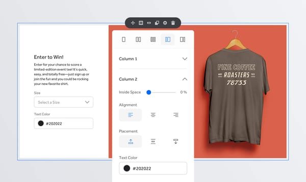
Now that we had identified key starting components, and organized those components by purpose and relationship, I began to explore design solutions.
Follow along with us on our design system journey by checking me out on Dribbble.
While I was neck deep in buttons and patterns, our team was solving a hand full of other key problems.
Christopher Frost took our learnings and used them to create incredibly detailed wireframes for a parallel project that would be our playground. His work established hierarchy, language mechanics, key layout decisions and more.
Helen Frost, dug deep into the weeds of making our design system plans a reality, building the infrastructure of our system, informing most design decisions along the way.
Brandon, Jacob, Nick Vander Kolk and more contributed countless hours helping to develop our design system into what it is today.
Continued Reading
Many articles and books have influenced our process. Two resources that stand out are…
- Building a Visual Language article by Karri Saarinen
- Laying the Foundations book by Andrew Couldwell